Color & Surface
Black and Gold in Decorative Illustration
Dark fields, restrained gold accents and warm transitional colors create hierarchy without turning every surface into spectacle.
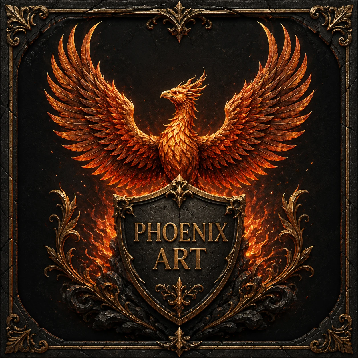
Black and gold form a high-contrast pair, but contrast alone does not make a coherent emblem. The useful design question is where each value appears and what it tells the viewer to notice. In the Phoenix Art study, graphite-black space contains the composition, copper feathers carry most of the form, and muted gold is reserved for edges, lettering and small ornamental turns.
Give black more than one value
A single flat black makes detail disappear. Build a family of near-black values instead: one for the background, another for the shield face, and a slightly lighter graphite for raised ornament. The image still reads as dark, but the viewer can separate its layers before any gold edge is added.
Texture should remain subordinate to value. Cracks and scratches become convincing when some vanish into shadow and others catch a restrained highlight. If every mark is equally visible, the surface looks printed rather than worn, and the central phoenix loses priority.
Reserve gold for decisions
Gold is most effective when it describes an edge, a title or a structural junction. A thin border around the shield explains its shape; a small highlight at a feather tip explains direction. Filling every feather and flourish with the same yellow removes those distinctions.
The V&A’s guide to metalworking shows that historical gold effects belong to specific techniques such as gilding, inlay or damascening. A digital illustrator may imitate their visual contrast, but the caption should say simulated gold or gold-colored light unless a documented physical object is actually being discussed.
Use copper as a bridge
Copper and terracotta sit between the darkest field and the brightest accents. They allow the phoenix to feel warm without making the whole bird emit light. Mid-tones are especially important in feather groups, where they keep one overlap readable against the next.
This bridge also protects legibility on a light editorial page. The artwork can remain dramatic inside its frame while surrounding headings and navigation use only a restrained copper accent. The page supports reading; the image carries the atmosphere.
Check hierarchy without color
Temporarily view the image in grayscale. The bird, shield and title should still separate clearly. If the emblem works only because orange and yellow are saturated, the underlying value structure needs revision.
Then return color gradually. Keep the brightest gold close to the title and a few feather edges, allow copper to describe volume, and leave enough graphite untouched. The result feels richer because the palette has roles rather than because it has more effects.
Working takeaway
Build the palette as a hierarchy: graphite contains, copper models form, and limited gold identifies the most important edges and lettering.
Sources and scope
These references support the historical and terminological framework. They do not endorse this publication or its illustrations.
- Victoria and Albert MuseumA guide to metalworking techniques
Museum guide to relief, chasing, engraving, etching, gilding and other documented metalworking processes.