Phoenix & Wings
How Wing Shapes Create Balance and Movement
Wing angle, taper, overlap and negative space can make a centered emblem feel stable without becoming static.
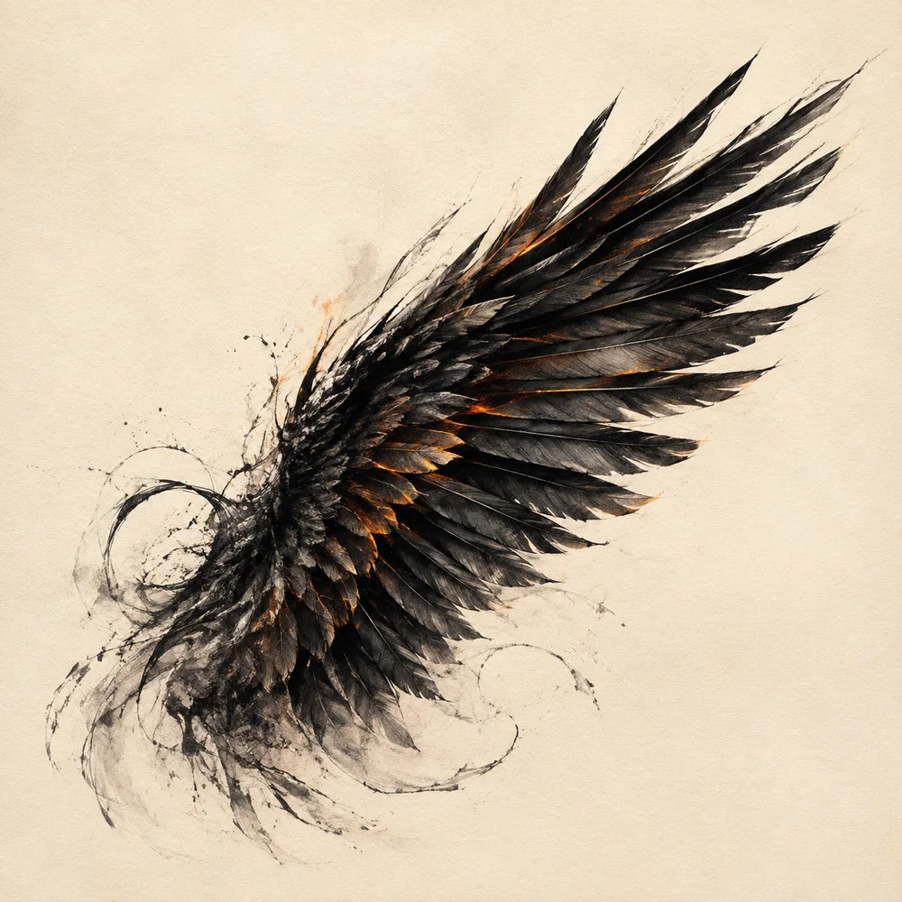
Wings carry more compositional weight than any individual feather. Their outer contour sets the width of the emblem, their angle establishes lift or repose, and the space between them frames the head. Before adding surface detail, an illustrator should be able to describe the pose with two broad masses and one clear center line.
Choose the gesture before the feather
An upward V suggests ascent and ceremony. A low horizontal spread feels broader and more defensive. Wings that curve inward focus attention on the head, while outward curves release energy toward the frame. Each choice changes the story before color or texture appears.
Reduce the drawing to a thumbnail and fill the bird as one shape. If the pose reads clearly, the gesture is working. If the body disappears between two unrelated fans, return to the large masses instead of solving the problem with sparks or outlines.
Balance does not require mirroring
A shield-based emblem benefits from bilateral balance because the central axis is easy to recognize. Exact reflection, however, can make a living subject feel manufactured. One wing may sit slightly higher while the head turns toward the lower side, creating counterweight.
Keep those differences structural rather than random. Change one large angle or overlap and let small feather groups follow it. Scattering unrelated asymmetries across the image produces noise instead of movement.
Use negative space as a third shape
The opening above the head and the wedges between wing and shield are active parts of the design. Even spacing creates calm; a narrow opening increases pressure. These gaps should remain visible at the smallest intended presentation size.
Lettering needs its own protected space. In the featured composition, the shield separates the words PHOENIX ART from the dense feather field. The wings lead the eye toward the title but do not cross it.
Group feathers by function
Treat the leading edge, middle coverts and long terminal shapes as separate visual groups. Their lengths and spacing should describe the turn of the wing. Drawing every feather with equal contrast flattens the form.
The final rim light should touch selected group edges, not outline the entire bird uniformly. Broken highlights let the dark gaps remain useful and make the warm edge feel like illumination rather than a sticker border.
Working takeaway
Design wings as large directional masses first; feather detail should reinforce gesture, balance and negative space.
Sources and scope
These references support the historical and terminological framework. They do not endorse this publication or its illustrations.
- National Gallery of ArtBurning Phoenix by Jacques Callot
Open-access collection record and visual description of a 1628 phoenix etching.
- National Gallery of ArtThe Elements of Art: Symbolism and Place
Introductory framework for distinguishing a visible form from the idea assigned to it.