Phoenix & Wings
Designing a Phoenix Through Silhouette
Silhouette, wing rhythm and controlled detail give an invented creature presence before effects are added.
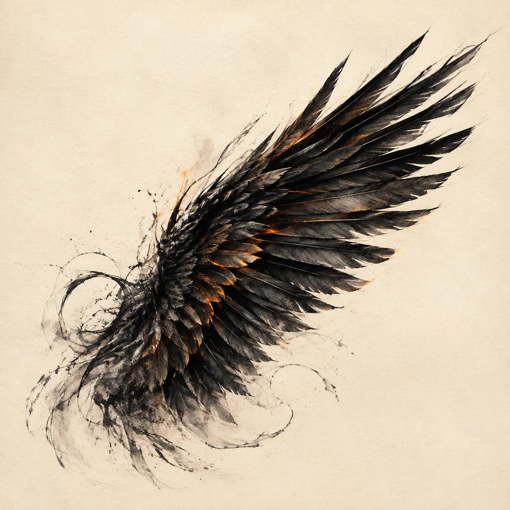
A mythical bird becomes legible through the same first test as any graphic figure: can the viewer read its posture at a glance? Fire, particles and texture can enrich the result, but they cannot rescue an uncertain silhouette. Begin with mass, direction and negative space.
Find the gesture line
Choose the movement before drawing individual feathers. A rising gesture may begin at the tail, travel through the spine and open across both wings. A guarded pose bends that line inward. The head angle should reinforce the same action instead of looking pasted onto a symmetrical body.
Our wing study exaggerates a single sweeping curve. It is not an anatomical plate. The dark brush mass establishes direction, while smaller ember edges reveal selected feather groups. This is a contemporary illustration exercise, not a record of a species.
Design the wing in groups
Thousands of separate strokes create noise if they lack hierarchy. Divide the wing into a leading edge, broad middle mass and a limited number of long terminal shapes. Change the spacing and length of those groups as the wing turns.
Jacques Callot’s Burning Phoenix shows how little information a small etching needs: an outstretched central bird, a rising field and a landscape are enough to establish the subject. Studying such economy can be more useful than adding another layer of sparks.
Balance symmetry with life
A frontal emblem benefits from broad bilateral balance, yet perfect mirroring can make the bird feel diagrammatic. Slight differences in feather overlap, head turn or flame direction keep the image alive while preserving the central axis.
Use asymmetry where it supports the pose. Do not scatter random differences across every detail. One wing may rise a little higher while the lower tail curves the opposite way, creating counterbalance rather than visual error.
Let material change the creature
An ink-like wing has absorbent edges and broken marks; a carved bird depends on planes, recesses and shadow; a luminous digital bird can be defined by emission and atmospheric haze. The same silhouette should be redrawn for the chosen material rather than simply covered by a texture.
Caption the medium truthfully. A generated digital study should not be described as charcoal on paper or as a photograph of carved stone. Material language can explain the visual reference—“ink-like,” “stone-inspired”—while keeping the object’s actual origin clear.
Working takeaway
Build the bird from gesture, grouped wing shapes and deliberate asymmetry; effects should clarify that structure, not replace it.
Sources and scope
These references support the historical and terminological framework. They do not endorse this publication or its illustrations.
- National Gallery of ArtBurning Phoenix by Jacques Callot
Open-access collection record and visual description of a 1628 phoenix etching.
- National Gallery of ArtThe Elements of Art: Symbolism and Place
Introductory framework for distinguishing a visible form from the idea assigned to it.